
Made it easier to find desired OYO-Life property online
Moving to a different city in India without knowing anything about it? Oyolife offers co-living spaces in over 700 locations across seven major cities in India. It aims to provide fully furnished spaces with essential amenities like parking facilities, mess areas, workspaces, play areas, and more.
Booking or renting a property online without personally visiting it isn't easy; doubts often arise. Additionally, landlords might unreasonably reject offers based on factors such as religion, pet ownership, or bachelor status.
Oyolife aimed to address this issue by assisting people in finding a safe, clean, and stress-free living space. Consequently, I was tasked with investigating the reasons behind the low leads on the Oyolife mobile website, which accounts for 80% of the total traffic.
After conducting research through user interviews and analyzing data from analytical tools, I discovered several issues with Oyolife's mobile site:
• It fails to offer users a satisfactory search experience.
• The lack of essential information about the properties makes users hesitant to book rooms online, despite the option of a fully refundable booking.
• The website's design does not instill trust among users, despite their positive perception of the room quality depicted in the pictures.
Employing a 'lean research and A/B testing' approach, the team swiftly generated ideas to address the issue using available backend resources and data. Collaborating closely with the product manager and engineers, I gained insights into technical constraints during the early stages of design, enabling us to deliver a solution within tight timelines. Furthermore, delving deeply into the challenges faced by sales representatives was crucial to converting the online leads generated to understand the further opportunities to improve lead generation.
Progress
• 80% Increase in use of search options from 20%
• 5% Increase in no. of leads generated through mobile site
• Increased use of filters to find the desired property
How I approached it?
01.
Teamed up with product manger, sales and engineers
02.
User tested the exisiting solution and gathered feedback
03.
Worked with engineers closely to grasp understanding system
04.
Delivered the solution within stirct timelines
05.
Implemented A/B testing for solution enhancement and fine-tuning.
Research & Evaluation
After interviewing 5 users who relocated for work or studies, all of whom conducted online research to find suitable accommodations, it was revealed that 3 out of 5 were staying in Oyolife properties.
Key factors considered by these users included:
-
Proximity to their college or office
-
Availability of public transportation from the locality
-
The presence of nearby grocery shops, chemists, and parks
-
Awareness of the current rental trends in the area
For a deeper understanding, I conducted testing of the previous version of the Oyolife mobile site with 5 users to better empathize with their experiences.
My findings

Unclear hint text on the search bar
The help text for 'Location/Landmark' in the search bar caused hesitation and confusion among users regarding what to input. Additionally, 90% of Oyolife users express interest in residing in Oyolife when moving from a different city. However, many lack understanding of specific areas and are more at ease typing the location of their office or college to find nearby accommodations
02
No information about Gender
During the research, it was discovered that 65% of the time, properties are either directly searched or approved by parents. Consequently, the inclusion of gender information becomes crucial, as all respondents (100%) expressed their preference for single-gender properties, highlighting the importance of catering to this aspect.


03
The name of the property truncates the locality
It appears that the property name isn't significantly aiding users; instead, they are more inclined to prioritize checking the locality name when making their decision
04
No clear action to check more details about the property
The previous design seemed to focus solely on generating leads without adequately considering the users' need for additional information to make an informed decision about whether to consider that property or not.

Ideation and Testing
The aim is to enhance engagement on the platform by ensuring the "create a post" feature is easily discoverable, user-friendly, and responsive.
Implementation

Used actionable copy
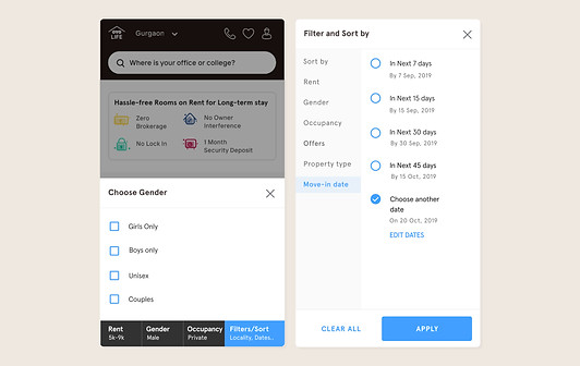
Solution: The help text in the search bar changed to “Where is your office or college” from Location/landmark
Why I did that: Following user interviews, it became evident that users lack awareness of nearby areas or popular localities. However, their preference is to reside close to their workspace or college to minimize travel time. Therefore, incorporating filters based on the location of their office or college has proven effective in helping users find suitable accommodations
Result: 8 out of 10 users started using search to find their desired property
02
Enhance visibility of desired information
Solution: The property card prominently displays clear information regarding gender specifics, occupancy, main amenities, pricing, and location. The straightforward action button 'View Home' eliminates confusion and effectively guides users to explore further details.
Why I did that: From user research, it became clear that key factors influencing user decisions are gender specifics, occupancy, available amenities, pricing, and location. Moreover, the action buttons 'Book Free Visit' and 'Pay to Book' were instrumental in guiding users to access more detailed property information.
Result: The newer design has improved the no. of page views on the property detail page by 25% and increased the leads by 5%.

03
Add multiple touchpoints to find a property
Solution: Bring the option to select more popular filters i.e. price, gender, and occupancy on the listing page itself.
Why I did that: With data analytics tools we found out the most frequently used filters to find a property were occupancy and gender
Result: This has reduced the no. of page views on the filter screen as users were getting the most frequent on the listing page itself which has ultimately increased the use of filters like price, gender, and occupancy.
04
A/B testing
We A/B tested two versions first with one action button “View More” and the other with two action buttons “Schedule a visit” and View More.
Result: We opted for variant A as it streamlined the decision-making process without impacting the number of leads. Subsequently, we altered the button copy from 'View More' to 'Check Room' to offer users a clearer understanding of what they would find next.

Visuals


Thank you!
Key Learnings
This was my first step towards improving the experience for OYOLife and the results were quite motivating. This project was not only about improving the discoverability of the properties on the listing page but it proposed helped the business understand their users better and identify their expectation from the mobile site.
Say Hello!